Tuesday, July 8, 2008

As If Ako...


A few weeks from today will mark the fourth anniversary of the death of my friend Chikako Atsuta. Had she maybe taken a moment longer to leave for work on that brilliant August morning in 2004, Ako would have simply been 39 years and 202 days old. Instead, she perished beneath the wheels of a lumber truck on a city street while riding her bike to work, and those precious few years and days were all she got. Some of her ashes and bits of bone are buried under a bench overlooking the sea in her beloved Gloucester, Massachusetts. The rest of her earthly remains are interred at her family’s shrine in Osaka.

Ako, an artist, author and poet (and amazingly, incongruously, Tiger Woods’ webmaster), had just e-mailed me something she had written in the early morning hours of her last day. It was a short poem describing her feelings about the sterility of the sports marketing office in which she worked. Nearly all of it was forgotten in the grief of the ensuing hours, days and weeks, and especially in my own misplaced guilt over not responding to her message immediately upon reading it that morning (and by doing so perhaps delaying her just enough to take her safely out of synch with an anonymous, inexperienced truck driver). The opening line, however, carried more irony and coincidence than I or any of her friends could stand.

“The air is dead, and so am I”

Ako was the most passionate worshipper of art and the natural and spiritual world I have ever met, which made the manner of her demise even harder to accept. That evening I was reminded of the grace and magic of the world in which Ako was so enmeshed. As I was leaving to meet my best friend and his wife and daughter for dinner at the 99 Restaurant in Waltham, I found myself bombarded by the most spectacular hailstorm I have ever witnessed, and afterwards, by an equally unsurpassed sunset below the dark receding storm clouds. The temptation to begin the next sentence with the words “it was as if…” is as strong now as it was that night when I toasted her memory with people she didn’t know at a restaurant she would have hated.

Monday, July 7, 2008

Al Stewart


I just finished my third album cover for singer/songwriter Al Stewart, a design project that was very close to my heart. I usually tell some version of this story when I am introducing myself to new classes at CDIA, so I thought it might be a good idea to post it here. This piece was originally written for my friend Neville Judd’s website. Neville wrote Al’s official biography Al Stewart: The True Life Adventures Of A Folk Rock Troubadour , published by Helter Skelter in 2002.

---

Sometime during the summer of 1974, a friend loaned me a copy of Al Stewart’s Past, Present and Future . I looked at the picture on the cover of that LP and, no lie, I told myself that I was going to learn to make photographs just like that, maybe even for musicians like Al Stewart someday. I had discovered photography earlier that year and had already decided that I would be some kind of professional photographer after graduating from high school, but it wasn’t until I saw that very well known black and white image that it all came together for me. I saw Al in concert for the first time at the Academy of Music in Philadelphia in early 1975, which was coincidentally the inauguration of his nearly 20-year partnership with guitarist Peter White. Just as coincidentally, a drummer named Steve Chapman opened for Al that night as part of Leo Sayer’s band.

After graduation I went on to drive a subway train in Philadelphia at night so I could teach myself photography during the day. Then came a stint as a camera store manager, 5 years as a portrait and society wedding photographer in Newport, RI, and, disillusioned by that experience, many, many more as a commercial and advertising photographer and designer in Boston. Throughout it all I continued to follow Al’s career over the years and never forgot the epiphany that he had unknowingly provided for me.

In 1991, I worked up the nerve to call Steve Chapman, now Al’s manager in Los Angeles (and Peter’s, who had started his own very successful solo career as a jazz guitarist). I asked if there was anything I could contribute photographically to Al’s next album. Steve said something like “what a strange coincidence, we were trying to figure out what we were going to do for that just the other day”. After describing an idea I had for a cover image, Steve gave me free rein to work with Al and Peter at their performance at the old Chestnut Cabaret in Philadelphia. The resulting images became the front and back covers of Rhymes In Rooms , and one of my teenage ambitions was happily checked off the list.

My career kept me pretty busy for much of the next decade, so it wasn’t until 2001 that things got interesting again. Peter and I had developed a friendship and he visited me one afternoon at my house outside of Boston that summer. Around the same time I sent some of my old concert photos of Al taken throughout the previous 25 years to Kim Dyer to use on alstewart.com. That led to an invitation to shoot Al’s Grace Cathedral show in San Francisco in November of that year where I met, unforgettably, Neville Judd. Neville and I hit it off instantly and he later hired me to design the package for the Live at Grace Cathedral DVD.

A few months later Neville fell ill while driving Al to a series of shows in the Northeast. Steve Chapman called that night asking if I could fill in as driver for the last week of the tour. Assuming it was actually just Neville having a bit of fun with me, I laughed at the thought of such a thing. Apparentlys the joke was on me because two days later, I stood in front of a hotel in Northampton, MA with his faxed itinerary in my hand and a big nervous smile on my face. A black limousine pulled up in front of me and out jumped Al, switching chauffeurs for the long haul to Philly and eventually New York. We had a blast over the next 5 days, and after finally delivering Al safely to his hotel in NYC, I called Steve’s office and told them that it was safe to take Lloyd’s of London off their speed dial.

After many more roadtrips with Al and a fully recovered Neville over the next few years, I was starting to feel pretty well acquainted with both of them. But I was absolutely unprepared for what happened next. I came home from work one evening in early 2005 to find a message from Al wondering if I “would like to knock off an album cover” for him. Neville had evidently filled Al’s head with exaggerated accounts of my design skills, so for the next month Al and I would talk on the phone most days and review design comps online. A Beach Full Of Shells was the result. ABFOS was later nominated for a media industry packaging design award, and was bumped out of the final round by, among others, the designer of Aimee Mann’s The Forgotten Arm . Had I made it to the final round, I would have been invited to the awards ceremony in LA. The industry legend who was rumored to have been on hand to acknowledge the winners that evening was none other than Storm Thorgeson, the creative genius behind Hipgnosis, the London design firm responsible for the cover of Past, Present and Future in 1974. That was a handshake I would have enjoyed, and, in the words of Maxwell Smart, I missed it by “that much”.

I figured that that was that, but Neville always has something up his sleeve. He called me earlier this year to ask if I had any interest in doing it all again. I said I did, and the next call was from Al. “It has to have a trireme on the cover this time”, he said excitedly, and after asking him 3 times to spell the word, I listened to a prĂ©cis about Hanno the Navigator while googling like a son of a gun. Like many of us, standard equipment while listening to Al’s music for me was always an encyclopedia and a dictionary, but these days I need to be close to my MacBook’s high-speed internet connection when I see his name come up on my Caller ID.

I found some excellent high-resolution photographs of a reproduction of a trireme built by the Hellenic Navy on their website. With their permission I used one as the basis for an illustration for the cover; I ghosted some Phoenician text of a contemporary account of Hanno’s voyages over the image and mocked the whole thing up with the working title Hanno the Navigator set in a font named Herculaneum and sent it over to Al. He liked it immediately, and without going any further he said that it was exactly what he was looking for (in one take, even!). The rest of the work came together over the next month or two, with the last remaining decision being the name of the CD itself.

Al told me he was thinking that the name of the disc would be Sparks Of Ancient Light (with the perfect acronym SoAL) as I was preparing the final artwork for Appleseed and EMI. I loved it, and hoped he would stick with it. Everyone involved began referring to the project as SoAL, but then he changed his mind. “How do you like The Secret Life of Clocks ”, he asked me one afternoon. I did, I told him, but I was already trying to figure out how I would bring a clock into the trireme illustration. “But maybe it’s not in keeping with the look of the artwork”, I said, realizing afterwards that that sounded a little self-serving.

“Then how about Yesterday and Tomorrow ?” he asked.

It seemed I was in on the naming decision at this point and tried my hardest to be diplomatic but helpful.

“That’s good too, but…”

Lost Victories ?” He had a list, and was reading through them all.

“Interesting”, I said. “That might work.”

Rose Colored Morning ?”

“mmmmmmm…” I wasn’t sure what to say about that one.

Wet ?”

“At the risk of stepping out of line” I said, “ Sparks Of Ancient Light has Al Stewart written all over it. It’s the perfect combination of words and image, and it supports the material beautifully”

“I know” he said. “We’ll probably stay with it, but I’m just afraid it doesn’t roll off the tongue very easily.”

Obviously, he stuck with it, and I think it’s a great title. I’m thrilled to have had the opportunity to contribute something to one of Al’s best pieces of work ever. And if I were standing on that awards stage in LA right now with Storm Thorgeson looking distractedly at his watch behind me while I ticked off a long list of those to whom I owe a debt of gratitude, at the head of that list would be Kim and Neville, Steve Chapman, my girlfriend and Production Assistant extraordinaire Jenny Chang (I dabble, but she really knows how to do this stuff), and finally, Al himself. This experience (and so many others like it) has been, for me literally, a dream come true.

Wednesday, April 9, 2008

Could It All Be Bullshit?


For the vast majority of young heterosexual men who set off in search of a career in photography (or at least for those of us who are honest about our ridiculous self-delusions) its siren song is often the real or metaphorical promise of “fast cars and naked women”. In the absence of more high-brow and imaginative motivators, I’m thinking “Blowup” and “Austin Powers” here, but for those of you otherly gendered or oriented, please don’t get mad at me, just insert your own intrigues in place of ours. Of course, there are those, like my friend and CDIA colleague Tim Lynch, who got into photography because they were told there would be “no math and no English”, but let’s leave that discussion for another time. The point is, many of us who stick with the business long enough eventually come to realize that, if we’re lucky, the reality of a job as a professional photographer usually amounts to something more like a beat-up Jetta and a loving girlfriend. But there is that rare breed, the ones who make it all the way to the top, who get the cars, the women, the South of France, the Tribeca studios, the monographs, the expensive limited edition of their favorite camera with their name engraved on the top, all of it. They drive the rest of us absolutely nuts, because, as we all like to imagine, we could have, we SHOULD have been them, and if we keep on pushing, we might still be. In other words, we’re jealous.

So, before we start, I should put a few things on the table. I’m a nobody in the world of photography, but I have a high opinion about what it means to be a somebody. The following thoughts should be evaluated based on that understanding. Also, if you’ve read some of the older posts on this blog, you know that I have a Leica rangefinder camera, an M6 that I bought it in 1997 because I wanted to make pictures like Robert Frank and Henri Cartier-Bresson. I believed the hype then, and I still do. Nothing I have learned by using the little device has changed my mind about it. The camera is nearly perfect, and in the hands of someone who knows what he or she is doing, it can elevate that photographer’s process and product— it certainly did mine. But shooting with film cameras, even those as intoxicating as Leica rangefinders, has become less and less desirable as digital tools and technologies have matured. I now strive to make equally sensitive, insightful “old-school” photographs with digital equipment. Nevertheless, as anyone who knows me can certainly attest, I have spent the better part of 30 years sharing my awe and enthusiasm for the medium’s classic stylists and innovators who used the Leica camera. One of them, the heavy-hitter and Leica spokes-shooter Ralph Gibson, spoke recently at Boston University’s Photographic Resource Center.

Tim and I brought our “Photographic Seeing” classes to the PRC that evening for what would prove to be a rich learning experience, although some of us felt that the lessons learned had less to do with creative secrets revealed by a master of the medium and more to do with artspeak, intransigence, and a healthy dollop of good old fashioned ego. Our students seemed to agree afterwards that while art can be transcendent, artists can be somewhat otherwise, and it’s usually a good idea to remember to separate the two. I figured this out a long time ago, but still, by the end of the evening I had begun to ask myself whether everything I believe to be valuable and true about the nature of the type of photography that I love might be suspect. Could it all, to put it delicately, be bullshit?

Thankfully, after about 30 seconds of intense soul-searching, most of my heroes remain firmly plopped high on their pedestals, although my confidence is shaken. Frank, Cartier-Bresson, Lee Friedlander and all the rest are still up there in my opinion, maybe because they mostly managed to keep their mouths shut and let their pictures do the talking. These photographers, in other words, stayed out of the way of their photographs. Or maybe it’s because I just never sat in a room listening to them talk about their own work.

But there we all were with Ralph Gibson. He’s got a lot to say about what he’s done, much of it interesting, some of it supercilious, and a bit of it disappointing. He kicked off his lecture by describing himself early in life as a classic screw-up, a child of a Hollywood divorce and a high school dropout given the choice at 16 of either “the Navy or military school”. Choosing the former, he proceeded to flunk out of the Navy’s photography training program. A second chance at the course (granted only after promising to clean the latrine for six weeks) led to a defining moment: standing watch on deck late one night, he screamed to the heavens “I WANT TO BE A PHOTOGRAPHER!!!” and judging from a career spanning nearly the next half-century, the heavens apparently answered back “well, OK…” Sensing a bit of a kindred spirit, I smiled as echoes of my own early frustrations driving a subway train on endless graveyard shifts while dreaming of a life behind a camera rang in my head.

After his discharge, he attended art school in San Francisco, made the pilgrimage to New York, assisted Robert Frank and Dorothea Lange, and lived the life of a struggling young artist “nine months behind on the rent”. Then, seemingly like magic, he received a commission to photograph “in Fronce”, joined and then left Magnum, started his own publishing company, Lustrum Press, and basically never looked back. Why and how all that so suddenly materialized he didn’t say, but the old adage “if you want to make a million dollars in photography, start with two million” popped into my head as a possible explanation. He had hooked me with the fist-shaking swabby story and reeled me in with imagined coffee-and-donut runs for Frank and Lange, but I started to wiggle off the hook when it all began to sound vaguely pompous and disingenuous, supported by a slideshow that was at best uneven, and at worst, unexpectedly pedestrian.

None of this is meant to suggest that Gibson hasn’t worked hard and accomplished much. Guggenheim fellowships, NEA grants, Leica Medals of Excellence and Officiers de l'Ordre des Arts et des Lettres bestowed by the French government are not given out to just anybody, and he has earned all of these distinctions and more. He has managed to support himself through print sales for more than 40 years. His online portfolio (ralphgibson.com) is extensive and powerful, filled with wonderful photographs all made exclusively with Leica cameras. As noted by the former director of the Whitney Museum, David Ross, if he hadn’t chosen photography, Gibson probably would have become a graphic designer— his compositions are that elegant and formal. Indeed, many of the high-contrast, surreal images he showed at the PRC were masterful and thought provoking. But just as many of them seemed to have made the cut for no better reason than the name-and- place-dropping opportunities they presented; little more than somewhat interesting snapshots made with those expensive cameras.

Gibson stated that he is only as good as his next print, and that he wants to create not photographs, but “a photography. He didn’t explain what he meant by that. He also said that he’s not interested in how something looks, but rather “how it feels for [him] to be looking at something”. Lofty prose, that, and potentially a rhetorical minefield coming from someone whose most well-known images include that of a cheeky young nubile gently coaxing a feather from between the bared lobes of her derriere. Photographers have been saying such things for as long as I can remember, and only rarely make pictures that say anything at all to anyone other than themselves and the ranks of incestuous art-world sycophants or new age nitwits hardwired to subscribe to such drivel. Or ass men.

Where he lost me, and I suppose what became the catalyst for this essay, came about three-quarters of the way through his presentation. He flashed a familiar picture on the screen, a Catholic priest’s chin and Roman collar severely cropped and contrasty, and called it his “old favorite”. His new favorite, an image shot over the shoulder of a man in silhouette gazing at his lover’s tattooed backside while holding a sketchbook displaying a photograph of a classically sculpted male figure, was as trite as the priest’s shot was remarkable. But it somehow proved, to him at least, that a photographer using a digital camera and Photoshop would never be able to make pictures like his.

It was all I could do to keep from blurting out from my catbird seat second-row center “Now hold on a second, sailor. That is simply a heapin’ helpin’ of BULLSHIT!” It appeared to me that what he was saying was that what he had done with his Leica, some film and a darkroom was better than what I or my students would ever be capable of doing simply by virtue of the different tools we use to do it.

I go to great lengths to instill in my students my belief that, regardless of what technology they choose to employ, photography is still photography, digital or otherwise. If their goal is to make highly complex photographic illustrations using all of Photoshop’s smoke and mirrors, they should knock themselves out learning how to do it to the highest level of quality that they can. If, on the other hand, they want their photographs to be unmanipulated, faithful representations of what they see and feel, they can do that with a digital camera as easily and masterfully as they ever could with a film camera, and probably even more so. Photoshop is a digital darkroom as well as a retoucher’s studio, and as it’s always been, it’s up to the photographer to decide how much of either to employ.

Later, during the question and answer session, I asked him what he would say to a student learning digital photography in 2008, based on what he said about his new favorite picture. He cut me off before I could finish, saying, “I know where you’re going with this. First of all, it’s not digital photography, it’s digital IMAGING…” the same way he might say “it’s not fois gras on that silver plate there, it’s ground-up goose guts.” He continued with his answer, but frankly, I tuned much of the rest of it out as I tried to figure out whether he was arrogant or simply misinformed. I vaguely remember hearing something about f-stops, shutter speeds, and him knowing about all “those cameras” that he would never use unless he was paid enough money to do so. With that one definitive proclamation, he had dissed my question, my students, and the present and future state of his medium.

As he finished his answer and turned abruptly away from me to take another question (cutting off any chance of the follow-up that I was trying to formulate) I heard a piece of music beginning to loop around in my head. It was the work of another American ex-pat now living in Provence, the truly brilliant underground cartoonist-cum-banjoist R.Crumb. Backed by his honky-tonk ensemble The Cheap Suit Serenaders, he recorded what would have made the perfect soundtrack for Mr. Gibson’s attitude toward those of us unfortunate enough to be photographers in the digital age. It’s an incessant little ditty entitled “Fine Artiste’, and a line or two of it goes like this:

Well, my paintings are famous
And they’re worth lots of dough
Pretty girls all hang around my gallery show
I’m as good with my paintbrush as I am with my lips
Stick around honey, learn some aesthetic tips!
Baby I’m a Fine Artiste
Baby I deserve to be kissed...

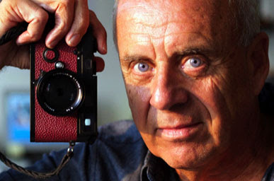
Mr. Gibson, I suspect, will keep on truckin’. There’s now a Ralph Gibson limited edition of 50 specially modified and autographed Leica MP camera bodies available from his online “boutique” all tarted up provocatively in black lacquer and red leather. Owning one of these little trollops will set you back $5000.00 sans lens, which is about 2 grand more than the stock version of the same camera. One would drape perfectly around one’s neck while strolling down the Promenade des Anglais, and would surely be the perfect instrument for creating "a photography" of one's own.

Tuesday, January 8, 2008

My 15 Minutes


I was asked to do a live digital photography demo at CDIA’s Open House last week. I was obviously flattered, but I also couldn’t help wondering why they would ask me, the new guy, to represent and encapsulate the entire program in a concise 15 minute show-and tell. I mentioned it to my friend and colleague Tim Lynch, and he said something like “I used to do them, but….” His voice trailed off and his eyes were locked in a kind of haunted thousand-yard stare. In the back of my mind I had that old Three Stooges routine running as a loop, the one where the boys are in the army and their sergeant asks for three volunteers to step forward for a dangerous mission. All at once the rest of the squad takes a giant step backwards leaving, you guessed it, three hapless heroes-to-be. Suddenly I felt like one of them, Curly being the most likely.

But it turned out to be a blast.

First I had to decide what I was going to do. Bob Daniels, CDIA’s Executive Director, asked only that I do a portrait demonstration. I didn’t want to do a boring three-light headshot; I wanted something a little more dynamic that showed the integration of the camera, RAW development in Lightroom, and a little Photoshop magic. But it had to be something I could start and finish in front of a studio full of people in about 15 minutes. I quickly arrived at a concept for an image that I hoped would look fresh and exciting to an audience of mixed age, experience and expectations.

I got to school early enough to make a quick shot of Queen’s, a dry-cleaning establishment two doors down Moody Street. One of the things I love about Waltham is its aging architecture, much of it supporting evidence of the city’s claim to be the birthplace of the Industrial Revolution. Queen’s probably wasn't doing Francis Cabot Lowell's laundry when he built the first power loom in 1813, but the great old neon sign above the front door looks like it might have been first plugged in 1954 or so. Close enough. I laid the camera and wide-angle lens down on the sidewalk in front of a manhole cover, pointed it up at the sign, waited for a break in the traffic in the background, and let ‘er rip. I “chimped” the LCD and the histogram instead of using the viewfinder to compose and expose— I thought I already looked odd enough kneeling down in front of a dry-cleaner’s on a bitter-cold afternoon without having to actually lay down on the sidewalk to look through the camera. Satisfied that I had the background for my final shot, I went inside and set up some lights.

We had a standing-room only crowd for the Open House, somewhere upwards of 150 people or so. After some introductory remarks from Bob, people started heading off in different directions to listen to more focused presentations from each program’s faculty and staff. As usual, nearly half of the attendees were there for the Photography program. That meant that as many as 70 people would be watching my demo.

I went on about an hour later. After telling some lame story about my never being very good at “shooting in a pack”, I explained what I was going to (hopefully) do, and then asked for a volunteer from the audience. No sooner had I gotten the first two syllables of the word out of my mouth when a hand shot up on the left side of the room and a young woman bounced to her feet. Her name was Aurora, she had already signed up for the photography program and would be starting in two weeks. I told her she would probably be spending much of the next 7 weeks with me in a pair of modules called Camera And Workflow, but I think at that moment she just wanted to have her picture taken.

I directed Aurora to a low platform I had set up in front of a dark gray seamless sweep and asked her to stoop down. Because I had shot the “background” of Queen’s from such a low angle I needed to do the same with Aurora. And this time, even with her up on apple boxes, I’d be laying on the floor. Being mindful not to flash a plumber’s smile at the folks sitting in the front row, I got on down and started shooting. I was tethered to Lightroom in my laptop using Nikon Camera Control Pro, so the audience could see the shots projected at the front of the room as I made them.

This shot called for motivated lighting, meaning it needed to be lit in a way that was believable when stripped into the existing background shot. I needed to suggest high overhead sunlight with a soft “kicker” low on the opposite side for separation. To do so, I hung a Profoto head shot into a beauty dish high to camera left, with a second head diffused through a 1x4 striplight on camera right rimlighting Aurora’s shadow side. I positioned a large black flag between the camera and the striplight to kill any lens flare that might result from the strong backlight.

After I had made a dozen or so shots, I stood up and thanked Aurora. I used Lightroom’s Library module to compare and rate the shots I had just taken, and we all decided that one of the last images appeared to be the best. Because I had processed the background shot of Queen’s using Lightroom’s Cold Tone preset as a starting point, (resulting in a contemporary-looking color palette of mostly desaturated cool blues and greens) I used the same preset again to develop Aurora’s shot. Finally, I sent both shots into Photoshop to make the final composite image.

At this point, Damian Hickey, a talented graduate of CDIA’s program and one of our TA’s, stood up to talk about the program from an alumni’s perspective. This was prearranged, so I could do the compositing work in the background as he spoke. I separated Aurora from the rest of the shot using Photoshop’s Magnetic Lasso, refined the selection edge a bit, and dragged her into the Queen’s shot. I flipped her horizontally so she would work better compositionally (meaning that my lighting notes above are actually reversed in the final composite image). A few quick tonality changes to the background, some Lens Blur added to Aurora’s lower body so she would blend better with the shallow focus in the low foreground, and some fussing with the shadows underneath her feet all resulted in the image you see at the top of this post. Not perfect by any stretch of the imagination, but not bad for about 15 minutes with a bunch of strangers watching.

During Bob’s introduction, he mentioned how our faculty was comprised mostly of “old guys” schooled in the “purer” methods of film, but who had all done whatever was necessary to evolve into successful and enthusiastic digital photographers. I liked that, and I made sure that I left the audience with two important thoughts. First, as I have written in this blog before, being a purist with a digital camera is as easy as being a purist with a film camera— it all comes down to discipline, vision, intent and restraint. But maybe more relevant to the aspiring professionals in the room, what I had just demonstrated, for better or worse, is the way photography is done in the commercial world of the twenty-first century. As a purist, I find it pretty interesting that I find that kind of cool.

Monday, December 17, 2007

The Truth About Reality


The school where I teach digital photography urges its instructors to remind our students that “Photoshop is not a verb.” I do, and everyone always laughs and then we talk about what the point of the statement is, about how important it still is to learn lighting and exposure and composition and cropping images in the camera and blah, blah, blah. In order to further encourage them to learn the skills necessary to "get it right in the camera" I ask them to pretend, for a little while at least, that it’s 1989 and Photoshop is not only not a verb, it’s not even a word because it hasn’t been invented yet. That goes over like a lead balloon.

Writing in the December 1, 2007 online edition of Newsweek, Peter Plagens posed a question that I’ve been asking myself a lot lately— “Is Photography Dead?” He goes on for several pages about how, on the surface at least, photography appears to be alive and kicking, maybe even too much so. “There are hordes of photographers out there”, he writes, “working with back-to-basics pinhole cameras and pixeled images measured in gigabytes, with street photography taken by cell phones and massive photo ‘shoots’ whose crews, complexity and expense resemble those of movie sets.” Plagens believes, however, that digital technology has led many of these photographers into a world of make-believe, one where “reality” is often defined by their fictive imaginations powered by Photoshop skills instead of their truthful observations. In his view, photographers are moving away from their traditional role as "truth-bearers" toward a postmodernist sensibility fueled by easy and popular access to digital cameras and software. He sees it as nothing less than struggle for photography’s very soul.

And so do I, kind of. But I’m thinking a little more, I suppose you might say, cautiously optimistic than Mr. Plagens. I actually think that a more pertinent question to ask ourselves is “Is Digital Photography Alive?”, and my answer to that is "Of Course It Is, If You Want It To Be." To understand where I’m going with this, you have to consider what one self-help cult I got roped into joining by an ex-girlfriend used to like to demand of its adherents back in the 1980’s. You have to understand and accept “The Truth About Reality”.

Photography has never been about “truth” or “reality”, and anyone who thinks that it has been probably sees the film-versus-digital debate in far more starkly divided terms than I do. Photographers are visual editors. That means that all photography is editorial (opinion-based) in nature for many reasons, the simplest of which is the existence of the camera’s viewfinder. In use, that innocuous little square or rectangular window is anything but ambivalent and all-inclusive, and civilization has been manipulated by it since the first photographer tried to figure out just what exactly to point the contraption it was attached to at. Using it to frame the world in combination with our all-too-human proclivities toward empathy, revulsion, and awe results in not the photograph itself stating “Here is the truth”, but rather the photographer exclaiming “Here is the truth I saw”.

In general, photographers (unlike painters, for instance) don't start with a blank canvas when composing our images. We're forced to bring order to THE ENTIRE WORLD by using the viewfinder to exclude everything that doesn’t belong. We edit, even the purest purists among us, every time we choose to point the camera HERE instead of THERE. By doing so we are eliminating options and manipulating our images in a way designed to elicit a particular response. Photographic composition is a wonderful puzzle-palace of tension driven by a constant subjective analysis of what to include and what to exclude, always shooting for what Edward Weston described as "the strongest way of seeing. But make no mistake about it. Whether editing in the camera, in the darkroom, or in Photoshop, we have always manipulatied not only our images, but our viewers. The rightness or wrongness of that really only comes down to a matter of degree.

The temptations offered to us by digital photography can be either inclusive or exclusive to the point of becoming occlusive. If we're not careful, we wind up spending far too much time thinking about way too many options, and in my opinion, too much of it after the fact. Henri Cartier-Bresson once said something along these lines: “Photography doesn’t take brains. It takes sensitivity, a finger and two legs.” These days, photography does take brains, and it requires a lot of thinking. Unfortunately, the complexity of the process usually means that we’re thinking when we should be feeling, witnessing and reacting instead. As a result of that we often wind up “Photoshopping” the living daylights out of what should have been a more clearly perceived image in the first place. When asked by a student “how do I get rid of the telephone pole growing out of the top of this guy’s head?” my answer used to be “pay more attention to the visual relationships between EVERYTHING in the viewfinder next time, that’s how.” Nowadays, I still say that, but then I have to go ahead and show them how to get rid of it anyway. It sometimes seems as if the perception of photography in 2007 has more to do with the Clone Stamp and Patch tools than it does with learning how to see, think and feel clearly with a camera. It's why I think we should be asking ourselves not whether photography is dead, but whether digital photography is alive. Being alive, even when practiced diligently, is an exercise in unpredictability, intuition and faith. For me and what I do, photography is just like that and it's why I love it. It's alive and well and always will be, regardless of whether I use a digital camera or not. But like so much else in our world today, I see it being over thought and overdone by so many people, and when something is overdone, the way to correct it is to apply restraint. Unfortunately, restraint isn’t available as a Photoshop plug-in, at least not in the current release.

Plagens quotes photographer Lisette Model as saying “Photography is the easiest art, which perhaps makes it the hardest.” She said a mouthful there, especially as it relates to photography in the twenty-first century. But I think Jerry Uelsmann’s perspective is equally valid here. A true visionary, if anyone should be pissed off at how Photoshop and digital technology have transformed the practice of photography it should be him. Uelsmann creates incredibly realized, impossibly stitched-together dreamscapes with traditional film and chemical photography, and has been doing so for the better part of four decades. He uses a series of enlargers in his darkroom to record and blend portions of multiple negatives onto a single sheet of photographic paper. The result is a composite masterpiece that can take days to make perfectly (like the one at the top of this post), but that could be made so much more easily, precisely and repeatably by anyone with a computer and a modest knowledge of Photoshop. When asked about this by John Paul Caponigro in 1997, Uelsmann was surprisingly upbeat.

“I certainly don't feel threatened by the computer. It's a tool. It's another way of making marks…I figured out pretty early, even in the darkroom, having too many options is counter productive to the creative process. The computer is the king of too many options.”

And maybe that's the point of all this. Too many options may be just that, too many options. Truth and reality, while never clear or absolute, can be snugged up pretty close to by eliminating unnecessary options.

Friday, October 19, 2007

Relevance, Reminiscence, and Teaching Smart People


When I left the freelance world and took a job as a catalog photographer at Filenes in 1995, I made a sign for the top of my computer cart that said “Just an analog guy trapped in a digital world”. It stayed there until a bright August day 11 years later when the merger with Macy’s shut the place down forever. My sign started out as a smug statement of defiance and skepticism toward the intrusion of cold, hard digital precision to what had always been, for me at least, a soft and wonderfully quirky craft.

But by the time I flicked off the studio lights that last day, my feelings about digital photography had changed completely and irrevocably. Filenes’ parent company had been an early adopter of high-end digital photography and had equipped our studio with state-of-the-art gear and first class imaging support. Even so, most of our photographers and designers seemed to be unwilling or unable to overcome the inertia resulting from years of working with film (and I definitely included myself among them, at least at the beginning). We were shooting digitally the way we had shot with film, and what we did often seemed pretty crazy and ass-backwards as a result. Seeing that, and seeing how much of the rest of the photographic industry was finding new ways of doing the same old stuff better, I challenged myself to fully embrace and even champion “digital thinking”, often to the consternation of many of my colleagues. I just couldn’t understand why everybody else wouldn’t be itching to take the dive with me. But never one to doubt the righteousness of my position in the face of overwhelming lack of popular agreement, I hung tight and managed to drag anyone working with photography at Filenes kicking and screaming into the present. The advisory “Grow or Die” never seemed more prescient than it did among the ranks of photographers and other creative professionals in the 1990s. Reluctantly or not, we all grew, but inevitably, Filenes died.

Then I started teaching, and I found myself standing at the front of classrooms packed to the rafters with smart people. Doctors, lawyers, authors, Harvard and MIT professors, software engineers, web developers, even a “user experience designer”; you name it and they came to my workshops. But regardless of their backgrounds, every one of my students loved photography and the majority of them were way more digital-savvy than me. I was faced with the awkward challenge of teaching technology to people who, in many cases, wound up explaining it better right back to me.

At Filenes, our problem was not proactively updating the skills that some of us had spent a long time acquiring, partially out of laziness, partially out of fear of the steep new learning curve, but mostly because the nature of the work simply didn’t require it. There was no directive from senior management to “be more digital”; in fact, there was moderate opposition to it. I eventually changed because I wanted to remain intellectually and creatively challenged in an otherwise numbingly routine environment and, frankly, because I felt I owed it to myself to remain relevant as a commercial photographer.

But the teaching thing is different. First at NESOP and now at CDIA, I’ve been very surprised to learn that most of my students, regardless of age, know very little about film photography at all. Their exposure to the medium is entirely through digital cameras and computers, the result of which seems to be equating photography with hardware and software instead of with images and ideas.

So what do I do? I teach them photography. Photography the way I love it and learned it, but with digital cameras and computers instead of film and darkrooms. Photography that is primarily about pictures, not pixels. For every lecture about bit depth and color management there is an assignment to make photographs that illustrate how the students think and feel. For every Photoshop video tutorial by Scott Kelby and Jeff Schewe, there is a slide show about Duane Michals and Robert Frank. Old school, maybe, but I try to remember that even old schools eventually wind up with shiny new wings, and the good teachers are the ones who do their best to stay relevant.

Wednesday, October 3, 2007

Drinking the KoolAid


I showed Jenny my Leica the other day. It’s a modern M6, but other than some cosmetic changes and refinements, it’s essentially the same camera that many photographers have relied on for well over 50 years. She looked at it, held it in her hands, and acknowledged its substantial heft, obvious quality and sheer coolness. She raised it to her right eye, worked the aperture, the focus tab, and the film advance lever and dry-fired a shot. The shutter went “tick”. We both smiled. She looked up at me and said “you can’t sell it”.

The Leica camera came into being in Germany in the years prior to World War One as a pocketable alternative to the bulk of plate cameras and tripods in common use by serious photographers at the time. Alessandro Pasi, writing in “Leica: Witness To A Century” noted that the birth of the first still camera to use 35mm motion picture film brought with it “a new way of telling the story of the world with images. Without it, the twentieth would have been a truly shortsighted century.” I bought my M6 in 1997, just prior to a trip to Holland to photograph my then sister-in-law’s wedding. Owning a Leica rangefinder had been a dream of mine since my teenage book-learning days spent staring in awe at what Cartier-Bresson and Robert Frank had been able to do with Leicas of their own. Perhaps foolishly, I associated the quality of these great artists’ work with the camera that they used. It wasn’t until I started learning to use my own M6 that I realized that there was something about it that actually did change, if not improve, the quality of my photographs. This small, simple, yet extremely robust camera nearly begs to be used close-in with a wide angle lens and both eyes wide open. By doing so, photographers learn how to be unobtrusive participants in the scenes we capture, and that way of thinking about picture-making made me a better photographer almost overnight. Prior to my being born again as a digital photographer, I carried that camera for years through the streets of Amsterdam, Antwerp, Paris and many other strange and familiar places and never felt more in touch with the artists who had first inspired me.

Regardless of all that, however, I have been considering selling my beloved but under-used little film camera to help finance some new lenses for my digital Nikon. Leicas are almost prohibitively expensive but manage to hold their value pretty well, even in the digital age. I’m not a wealthy man, and the only way I managed to buy the M6 in the first place was by trading a 3-lens 4x5 view camera outfit for it (and even then, I had to throw in a check for $700). The nature of what I do these days calls for me to be all digital all the time, and the nature of my bank account calls for me to either dig for loose change between the sofa cushions when new equipment becomes necessary, or sell stuff that I’m not using. The Leica unfortunately sits at the front of that pile right now. Selling it would almost certainly pay for the lenses I need for my D200, but it would also be selling out, completely and absolutely. The romance of photography, for me at least, resides in that perfect device and the adventure it invites. The day I sell my Leica to buy ANYTHING relating to digital photography is the day I finally drink the KoolAid all the way down and lick the disgusting dregs from the bottom of the Dixie Cup.

Or so I thought. The circles close, at least mine usually do. The other night, a colleague at CDIA showed me his DIGITAL Leica, an M8. It looks and feels exactly like my M6, and works more like a simple film camera than any digital camera should be expected to. It’s not perfect, but considering the relentless march of technological overkill that has already made it an oddity a year after it hit the market, it’s perfect enough. As crazy as it sounds, seeing that camera makes me want sell everything I own, buy one of the things and go back to Amsterdam and Paris again. The day after I saw that guy’s M8, I fired up my MacBook Pro and opened a scan of one of the many Leica negatives I shot on that first trip to Holland in 1997. It was a nearly-forgotten shot I made at Amsterdam's Sex Museum that Jenny seemed to really like, so I worked it up in Photoshop a bit, then I made a gorgeous archival digital print for her apartment.